
Wavemaker Program
Role
Graphic Designer
Team
Designer (that’s me) / Owner of Organization
Mood
Conservative 💧
Project Overview
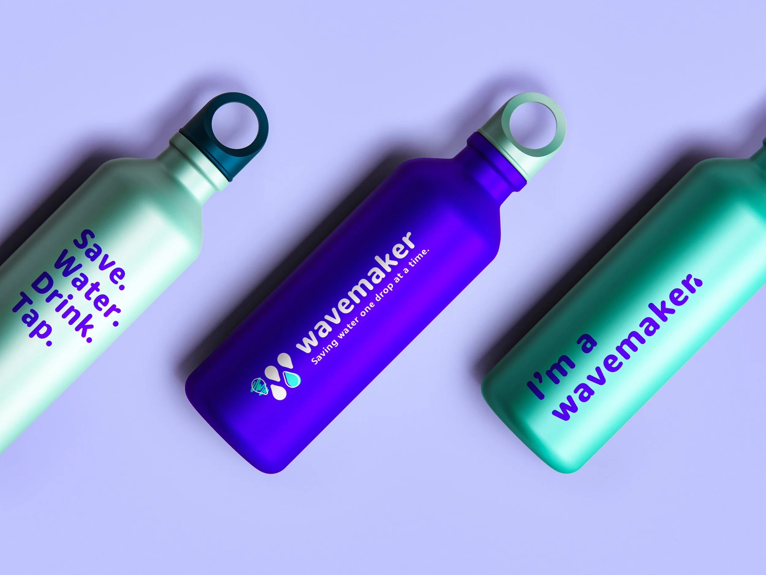
Create an identity for Drink Local, Drink Tap. INC., a non-profit organization based on solving local and global water issues. More specifically the organization wanted me to design an identity for their Wavemaker Program, which puts their organization inside the classroom and teaches children about water issues and what they can do to converse water.
Original Logo
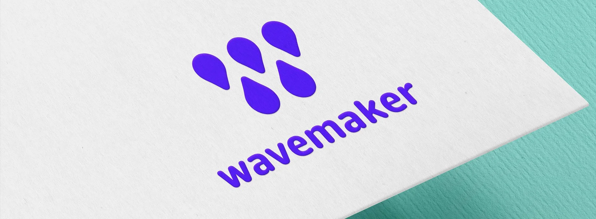
I wanted to refresh this branding I designed in 2013 for my senior project in college. The logomark represents the letters W & M in the name Wavemaker with each shape being an individual water drop, to represent what the program is about – water.
Refreshed Logo
The concept of my original logo is strong but other aspects of the logo needed a refresh such as the color, typography treatment and adjusting the logomark. The Wavemaker program is a kid focused educational program so when I worked on refreshing the logo I wanted it to be more friendly, bubbly and fun. Starting with color, the original logo has a dull teal color. I explored a variety of new colors and landed on this blue-purple which is very vibrant and energetic, its more fun and relates to the energetic presence kids have. Next is typography, the original logotype used a very thin sans serif font that was overpowered by the logomark. The refreshed logotype is much heavier and it's rounded, bubbly strokes align with the logomark as well as the friendly nature of the staff within the program. Lastly the logomark, the original is too stiff and flat. I refreshed the water drops to make them fatter, rounded and playful, once again leaning into the reasoning of this program being centered around children.

If you’d like to learn more about this project please reach out :)