Automotive Parts Finder
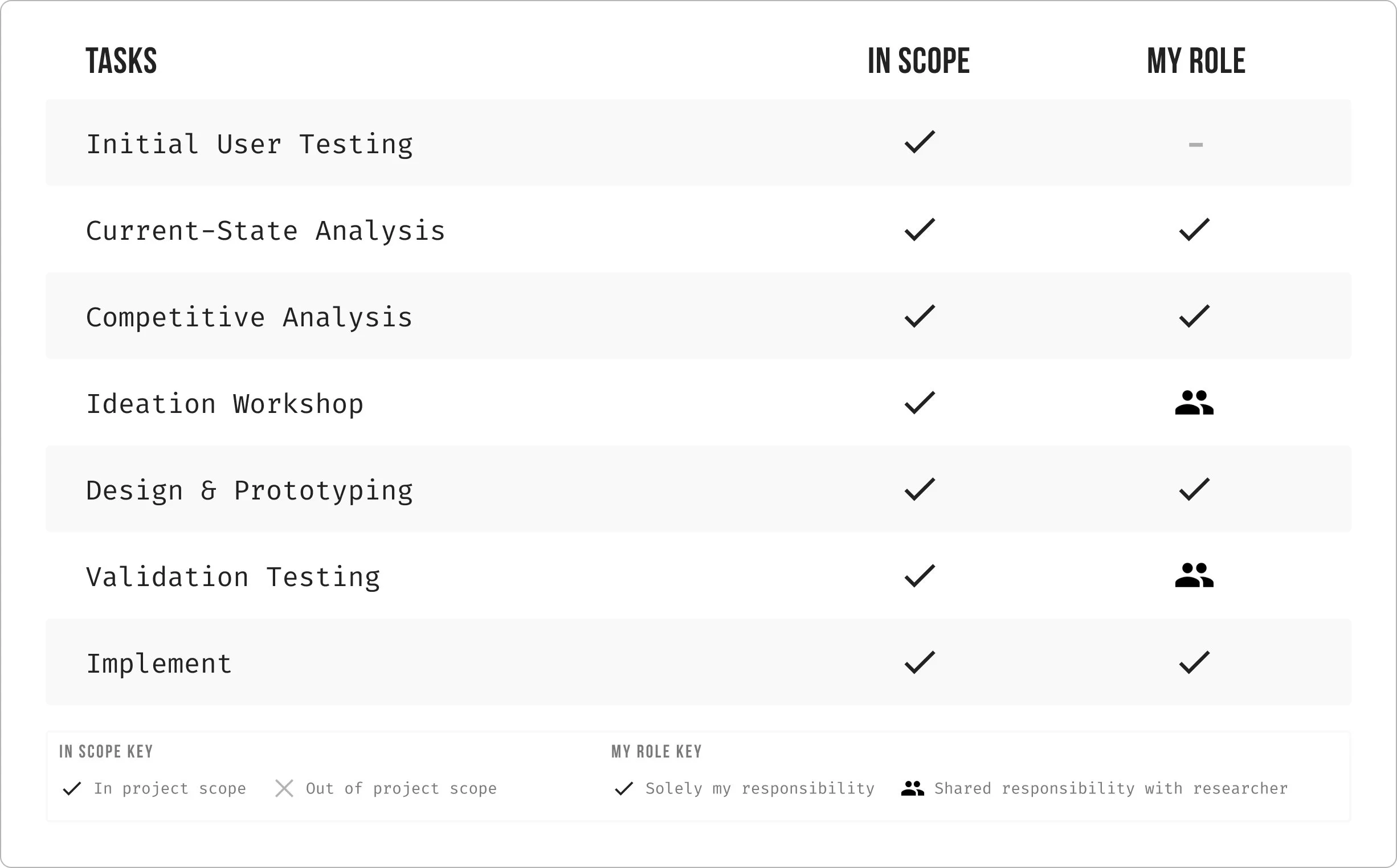
Role
UX / UI
Team
Product: Manager / Researcher / Designer (that’s me) / Engineers
Mood
Handy 🔧
The Challenge
Automotive is a fairly new category at Lowe’s. During a category deep-dive we launched an unmoderated survey to users to understand the that pain points they are facing so we could uncover where opportunities lie. The most common expectation of shopping for automotive products is having the ability for the user to put vehicle details into the shopping experience and filter by their vehicle. The current experience doesn’t provide any personalization so came the initiative to design and build a parts finder component.
What current state looked like without a parts finder experience.
Discovery Phase
Process
After understanding the goals and scope of the project we started researching to better understand what users expect out of a compatibility tool for auto parts.
Competitive Analysis
I analyzed a number of competitors in the automotive industry to see how their experiences stack up against Lowe's. I wanted to understand how other retailers provide vehicle personalization to help users find products that fit their specific vehicle deatils.
What I Discovered
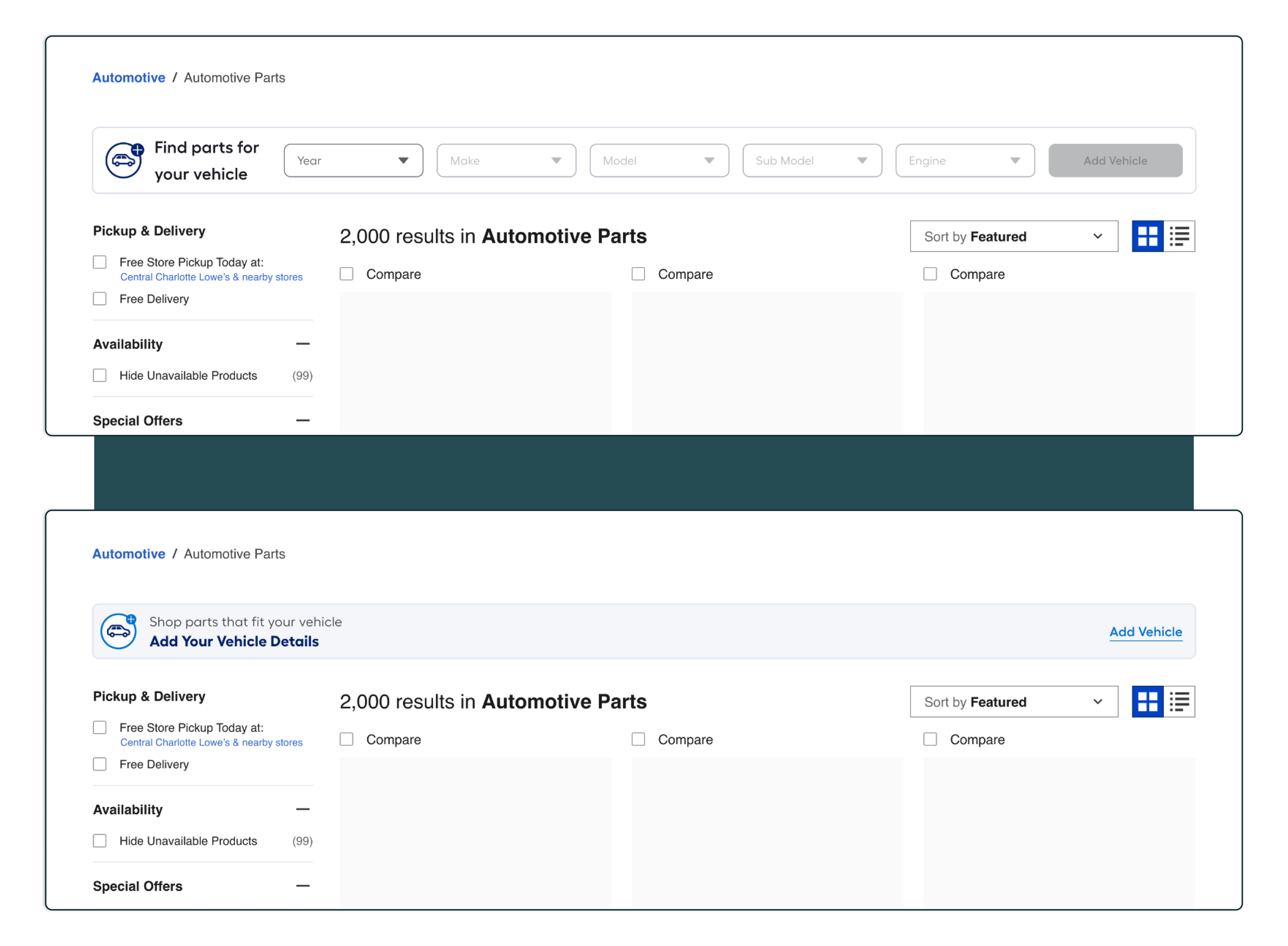
After analyzing several competitors, most mobile experiences had a similar flow, but for desktop I came across two common flows for a parts finder experience:
1.Dropdowns Embedded on Banner
For desktop, the dropdowns are embedded in the banner, making it easy for users can quickly select their vehicle specs and starting shopping.
2.Banner That Opens a Drawer
This banner has more context as to what the component does, but the user has to interact with it in order for a drawer to fly out where they can enter their vehicle deatils.
Develop Phase
Design & Prototyping
Based on the research insights, my analysis of the current-state Lowe’s Experience, and my in-depth competitive analysis I was able to build out two designs of what a parts finder component could look like for Lowe’s. I built a design for each of the trends discovered during my competitive analysis. We also explored what a saved vehicle hub experience would look like as well.
Validation testing
We ran a preference test for the desktop version to better understand which of the two experiences above users prefer. We also ran a test on the mobile experience to gain general feedback and to see if users found any pain points within the journey.
Final Design
After validation testing, for desktop the embedded dropdown experience was preferred. Based on my secondary research and the insights from testing I made updates to the designs and then handed it off to our dev team. Currently if you go to Lowes.com and search “Oil Filters” you can see phase 1 (without My Garage) of this experience live on the site.
If you’d like to learn more about this project please reach out :)


